
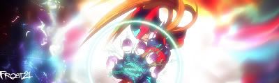
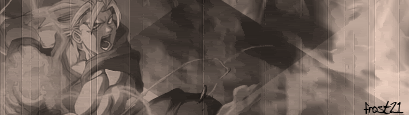
These are a couple sigs I actually had time to finish,not that experienced with ps yet.
Would love some constructive criticism.
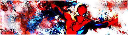
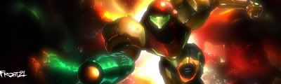
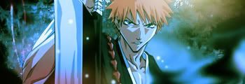
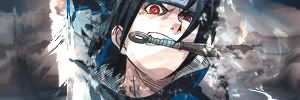
Yes I know the text I did put on was for my very first sigs,before I knew text actually made it appealing or unappealing.
Will add text to the last two when I get better at doing it.
Last one is not completely yet finished,but meh.
Would love some constructive criticism.
Yes I know the text I did put on was for my very first sigs,before I knew text actually made it appealing or unappealing.
Will add text to the last two when I get better at doing it.
Last one is not completely yet finished,but meh.


